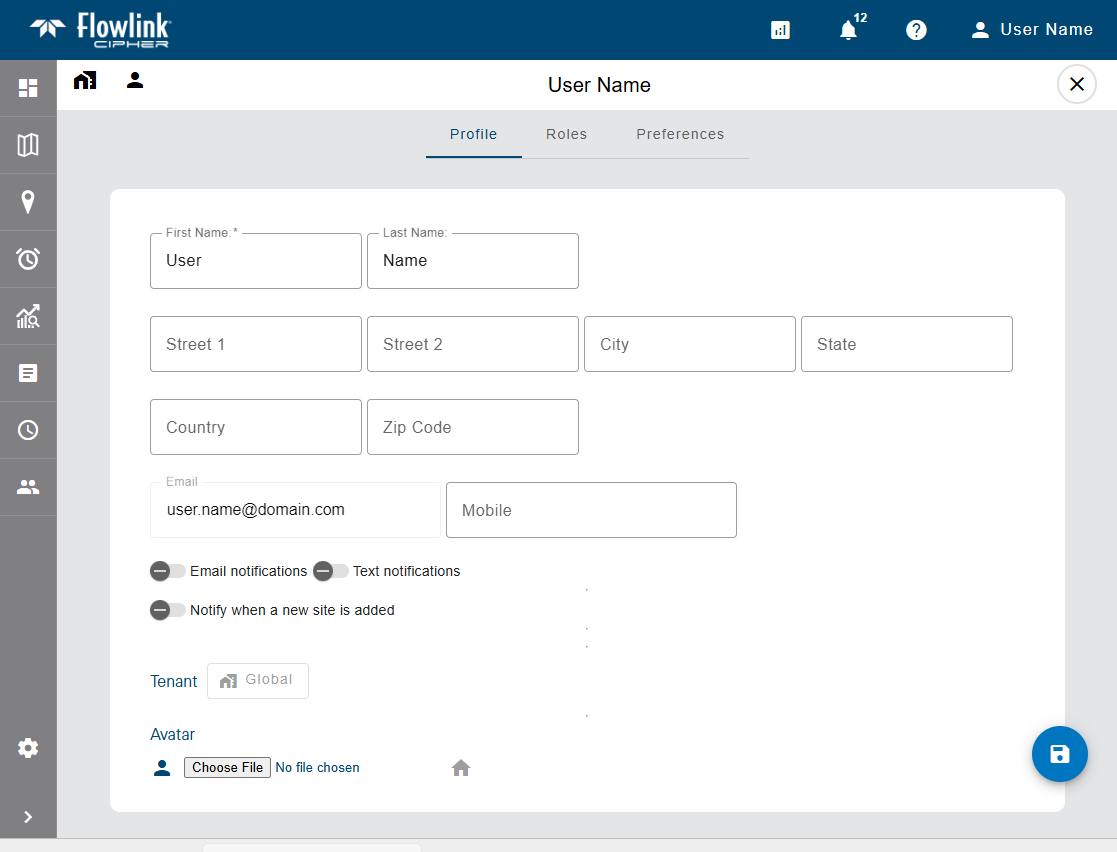
The Profile page for a user provides detailed information about the user account. This information can be viewed by all users with access to Flowlink Cipher, however some fields are only displayed when logged on as a user with the Administrator role.
The information on this page is provided in two separate tabs:
• Profile, which contains the settings for the user account.
• Preferences, which controls the user’s default settings for creating graphs and datasets. This tab is only available when a user is viewing their own user account.
Detailed information about each tab, as well as information about editing profile settings, is provided in the links below. Click each link to view the information.
Profile
The Profile tab contains the contact information for the user and controls various settings for the account. Many fields are populated using the values that were entered when the account was created, but others must be entered or selected manually. All fields other than Email can be edited at any time as needed.
User profile settings can only be changed by users with an Administrator role or by a user viewing their own profile.
The Admin section is used to define:
• the roles assigned to the user account, which is controlled by clicking the check boxes of the relevant roles.
• the status of the account, which is controlled by switching the toggle to either Active or Inactive. All user accounts are created as Active, but can be changed to Inactive to disable the account if it is no longer used. User accounts with a status of Inactive cannot be used to access Flowlink Cipher.
• the tenant to which the account has been assigned, which is controlled by clicking the tenant field and selecting the relevant tenant from the drop-down list.
Roles provide a user account with permissions to perform tasks in the application. At least one role must be assigned to a user when the account is created. Roles can be changed by any user with the Administrator role. Different functionality is allowed with each role. The available roles are:
Role | Description |
|---|---|
System Administrator | The System Administrator role is used solely for managing tenants. This role should only be assigned to a single user in each organization. Users with this role cannot be assigned to a tenant. |
Administrator | The Administrator role is used to manage user accounts and global options shared by all users. Users with this role can create, edit and delete user accounts in the Users page, and view and edit the application settings in the Settings page. This role also has access to the Dashboard functionality, but only for Note type gadgets. This role cannot be used to create, edit or view sites, graphs or alarms. |
Site Manager | The Site Manager role is used to manage the sites and devices monitored by Flowlink Cipher. Users with this role have full permissions for the Dashboard, Sites and Alarms pages. The Site Manager role also has read-only access for graphs and events in the Analysis pages. |
Editor | The Editor role is used to edit data that has been ingested in the application. Users with this role have full permissions to the Dashboards, Alarms and Analysis pages, except for deleting graphs marked as Public. This role can also be used to view sites and generate graphs or datasets from the sites, but cannot be used to edit site information or site tags. |
Analyst | The Analyst role is used to analyse incoming data. Users with this role have the same permissions as the Editor role except that they cannot edit the data points in a dataset. |
Viewer | The Viewer role is a read-only account used for viewing information in Flowlink Cipher. Users with this role have full permissions on the Dashboard page and read-only access on most other pages. This role cannot be used to create graphs, datasets or alarms and can only view graphs that have been created by other users and set as Public. |
API | The API role provides users with access to the API for the purpose of uploading and downloading data to and from Cipher. If the user has been assigned to an enclave, they can only upload or download data in that enclave. Users with this role do not have access to the web application. |
The Profile and Contact sections are used to specify the address and phone number for the user account.
The Notifications section is used to turn on/off email and/or text notifications. When enabled, the user will receive notifications in the selected form (email or SMS text) for various events in the system, such as the creation of a new site. In order to receive text notifications, the Mobile field must be populated with the phone number of a device that is capable of receiving text messages.
Note: Mobile phone numbers must be unique for each account, the same phone number cannot be used on multiple accounts.
The Avatar section is used to select an image to represent the user profile. If not set, the default user icon is the initials of the user name  . When set, the selected image is displayed at the top of each user card on the Users page and replaces the icon used for the Profile button
  in the toolbar at the top of the page. To select an avatar for the user account:
1. Go to the user profile of the relevant user either by clicking the Profile button or using the Go to Profile tool  on a user card on the Users page.
2. Click the Choose button under Avatar.
The Open file dialog box is displayed.
3. Select the relevant image file and click Open.
4. Click the Save button to save the changes to the profile.
The Profile button on the toolbar will be updated with the new avatar image. When viewing the Users page, the new image will be displayed on the user card for the updated profile.
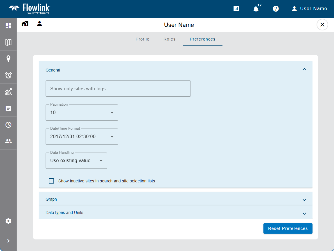
Preferences
The Preferences tab is used to define default settings for various pages and functions in the application, such as available sites, display settings, data units, and graph creation. The available settings are separated into categories that can be accessed from the list on the left of the Preferences screen. Each category of settings is explained below.
This tab is only available for a user when viewing their own user account because only they can define their user preferences.
The Reset Preferences button at the bottom of the categories list can be used to return all settings to their default values if needed.
General
The General category provides display settings for the application and lists of items displayed in a table format.
The following settings can be defined:
Option | Description |
|---|---|
Appearance | This setting determines the color scheme used to display the application. The options are: • Browser default: This option displays the application using the Light/Dark preference the user has chosen for the web browser. • Light: This option applies the Light display theme to the application, which causes all screens to display as dark text and icons on a bright (white) background. • Dark: This option applies the Dark display theme to the application, which causes all screens to display as light text and icons on a dark (black) background. |
Show only sites with tags | This setting is used to automatically filter any page or field in the application that displays a list of sites. By selecting tags for this setting, only sites with those tags assigned will be displayed in site lists. Clicking in the field displays a list of site tags that have been created in the system and are available to the user. If the user is assigned to a tenant, only tags assigned to sites in that tenant will be available. When this setting has been defined, a "Tags applied" note is displayed on the relevant pages/fields in the application, warning that the site list has been automatically filtered. |
Pagination | The default number of rows displayed in a table when viewing a page with a list of items in a table format, such as the Alarms and Reports lists. The options include 10, 25 and 50. This setting can be changed manually on the actual pages as needed. |
Data Handling | This option is used to control how points are handled in various functions if the points have error codes. There are four options: • Use existing value (default): The point retains its current value. • Use zero reading: A zero reading will replace the value of the point value. • Repeat last reading: The point value is updated to use the value of the previous point in the dataset. • Interpolate: A value is interpolated for the point using the last non-zero, non-error values, before and after the error point(s). When a point is processed by a function, if any of the data points have error codes, this setting will automatically be applied to the point values. This setting can be temporarily overridden using the Data Handling options of the currently active screen. |
Show inactive sites in search and site selection lists | Enable this option to have inactive sites displayed in search results and in site selection drop-down lists on various screens. If not enabled, inactive sites are not displayed in these lists. |
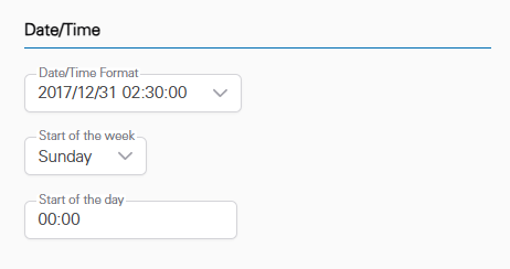
Date/Time
The Date/Time category provides settings to control the date and time format used in the application.
The following settings can be defined:
Option | Description |
|---|---|
Date/Time Format | The format used for date and time values in the application. The options include: • Month/Day/Year/Time • Day/Month/Year/Time • Year/Month/Day/Time |
Start of the week | This option defines the day of the week that will be used as the start of a week by certain tools and options in the application, such as the Relative date range options (This Week, Last Week) in the navigation toolbar on the graph screen. |
Start of the day | This option defines the time of day that will be used as the start of the day by certain tools and options in the application, such as the Relative date range options (Today, Yesterday) in the navigation toolbar on the graph screen. |
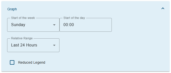
Graph
The Graph category is used to define default settings for graph configuration.
The following settings can be defined:
Option | Description |
|---|---|
Relative Range | This option specifies the default value to be selected for Relative data range fields in the application. |
Reduced Legend | Enable this option to limit the information displayed in graph legends to only the name of the quantity; the site and device names are not displayed. |
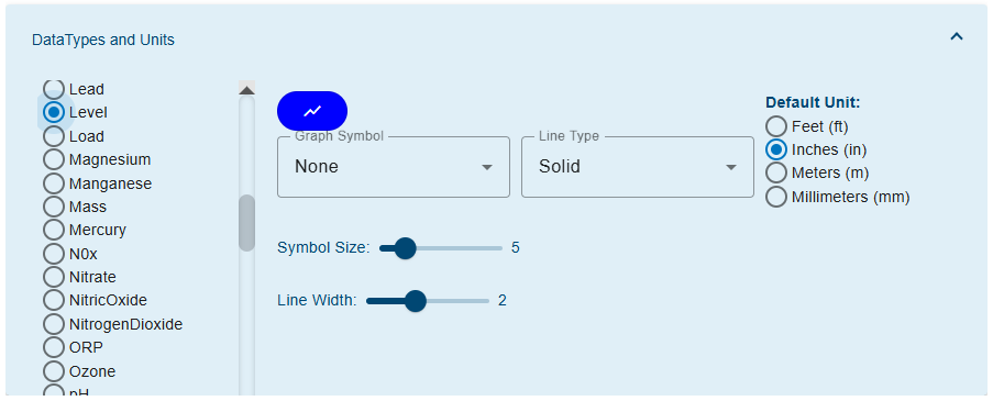
Data Types and Units
The Data Types and Units category is used to define default settings for each type of data that can be displayed in a graph. These settings will be applied automatically whenever a graph is populated with a dataset of a data type for which preferences have been selected. Different settings can be defined for each data type to provide easy identification of data when viewing a graph.
The following settings can be defined:
Option | Description |
|---|---|
Default Unit | The unit of measure that will be applied when displaying data of the selected data type. The list of possible units is populated based on the selected data type. 1. Select a data type from the list on the left. 2. Select a unit of measure from the Default Unit list. |
Graph Symbol | The shape used to display points in a dataset of the selected data type. If points should not be displayed for the selected data type, the None setting can be selected. 1. Select a data type from the list on the left. 2. Select an option from the Graph Symbol drop-down list. |
Symbol Size | The size of points when displayed in a dataset of the selected data type. 1. Select a data type from the list on the left. 2. Click and drag the Symbol Size control across the slider bar. 3. Release the mouse button when the preferred size is reached. |
Line Type | The display format of the line in a graph, either a solid line, a line of dashes or a line of dots. 1. Select a data type from the list on the left. 2. Select an option from the Line Type drop-down list. |
Line Thickness | The thickness of the line representing the data in a graph. 1. Select a data type from the list on the left. 2. Click and drag the Line Thickness control across the slider bar. 3. Release the mouse button when the preferred thickness is reached. |
Precision | The number of decimal places to use for the data in a graph. 1. Select a data type from the list on the left. 2. Select the number of decimal places from the Precision drop-down list. |
Dataset Color
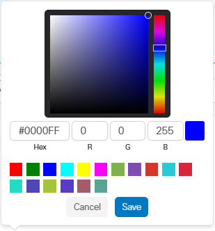
| The color used to display a dataset of the selected data type. 1. Select a data type from the list on the left. 2. Click the color button to launch the color picker.
Several methods are available for selecting a color: • Color palette: Move the color slider up/down the color scale bar to select a general color family and then click in the color palette to select a specific color. • Hexidecimal values: Enter the hexidecimal number of the desired color in the Hex field. • RGB values: Enter the RGB (red, green, blue) values of the desired color in the appropriate fields. • Predefined colors: Click one of the predefined color blocks to select that color. 3. Select a color using the various tools available in the color picker. 4. Click Save. The button will change to the selected color. |
Inverted | Invert the Y-axis of the dataset. Data values will increase from top to bottom in the graph instead of the default bottom to top. |
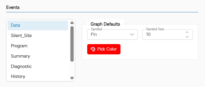
Events
The Events category is used to define display settings for the graphs that are provided when viewing the details of an event that has been triggered in the application. Different settings can be defined for each event type.
The following settings can be defined:
Option | Description |
|---|---|
Graph Symbol | The shape used to display points in a dataset for the selected event type. 1. Select an event type from the list on the left. 2. Select an option from the Graph Defaults: Symbol drop-down list. |
Symbol Size | The size of points when displayed in a dataset for the selected event type. 1. Select an event type from the list on the left. 2. Click in the Symbol Size field and either type a size value or use the Up/Down Arrow buttons to select a size. |
Color
| The color used to display a dataset for the selected event type. 1. Select an event type from the list on the left. 2. Click the color button to launch the color picker.
Several methods are available for selecting a color: • Color palette: Move the color slider up/down the color scale bar to select a general color family and then click in the color palette to select a specific color. • Hexidecimal values: Enter the hexidecimal number of the desired color in the Hex field. • RGB values: Enter the RGB (red, green, blue) values of the desired color in the appropriate fields. • Predefined colors: Click one of the predefined color blocks to select that color. 3. Select a color using the various tools available in the color picker. 4. Click Save. The button will change to the selected color. |
Editing a User Profile
To access the profile of the current user:
1. Click the Profile button  at the top of the page.
2. Select Profile from the menu that is displayed.
The profile of the current user is displayed.
To access the profile of another user:
1. Go to the Users page.
2. Click the Go to Profile button  in a user card on the Users page.
The profile of the selected user is displayed.
To make changes in a user profile:
1. Select the relevant tab at the top of the page.
2. Change settings as needed.
3. Click Save when finished.
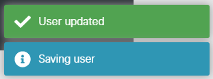
Messages will be displayed stating that the changes are being saved and the user has been updated.