Create a graph using ingested or computed datasets. All information for graphs is accessed from datasets associated with sites. This can be data ingested directly from a site, or a computed dataset created from the ingested data.
To create a graph, you must select the site and dataset(s) from which to populate the graph and define display properties for the graph and the datasets within it. This procedure is explained in the sections below.
If you attempt to navigate away from the page without saving changes, a message will be displayed to confirm that you want to leave the page without saving. If you click Yes, any unsaved changes will be lost; in the case of a new graph, the graph will not be created.
Site Selection
A graph displays data from one or more ingested or computed datasets. The first step in creating a graph is to select the sites to include. This is done in the Sites panel.
1. Expand the Sites panel by clicking the Sites tab.
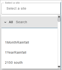
This panel contains the fields used to select the source data for the graph. The Select a site field is populated with all sites in the instance.
2. Click in the Select a site field to expand the field.
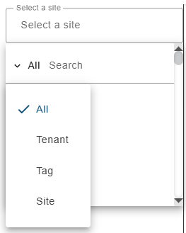
The list of sites can be filtered by specifying textual search criteria in the Search field at the top of the list. Only sites that match the text specified will be included in the list. A drop-down list beside the Search field can be used to filter the list even further by specifying the property in which to search for the matching text. Also, when a property is selected from the drop-down list, clicking in the Search field will display a drop-down list of possible values based on the selected property, allowing a value to be selected instead of entering it manually. When an option is selected, only sites with text in the selected property (tenant, tag, etc.) will be available.
3. Select a site from the list.
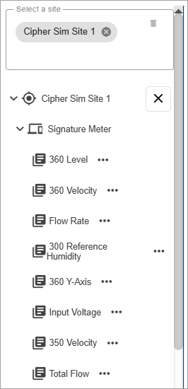
All ingested datasets and computed datasets available for the selected site will be displayed in a drop-down list. Additional sites can be selected to display more datasets if needed.
4. [Optional] Select additional sites as needed.
5. Expand the datasets drop-down lists to view the available datasets.
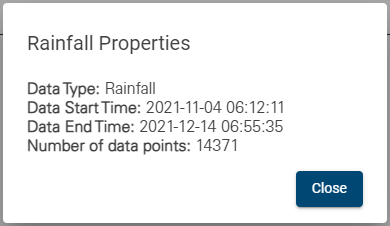
The Properties button (...) beside each dataset in the list displays a dialog box containing information about the dataset.
6. Click a dataset to add it to the graph.
The graph preview will be populated with data from the selected dataset and the name of the dataset will be added to the legend at the top of the graph. The color of the data in the graph is determined by the Data Types settings in the Preferences tab of the user’s profile page. See User Profile for information on the Data Types settings.
Moving the mouse cursor over the data in the graph will cause tooltips to be displayed for the data and the axis values. The data tooltip contains the name of each dataset in the graph, the color associated with each dataset and the value with units at the location of the cursor. The X axis tooltip displays the timestamp of the cursor’s current location for each dataset. The Y axis tooltips change to show the point value of each dataset in the graph pane at the current location of the cursor.
The order of the datasets in the data tooltip reflects the order of the datasets in the legend at the top of the graph, which is based on the order in which the datasets were added to the graph. If the graph contains multiple panes, the first dataset in the tooltip will be the dataset in the pane where the cursor is currently positioned, followed by the remaining datasets according to their order in the legend.
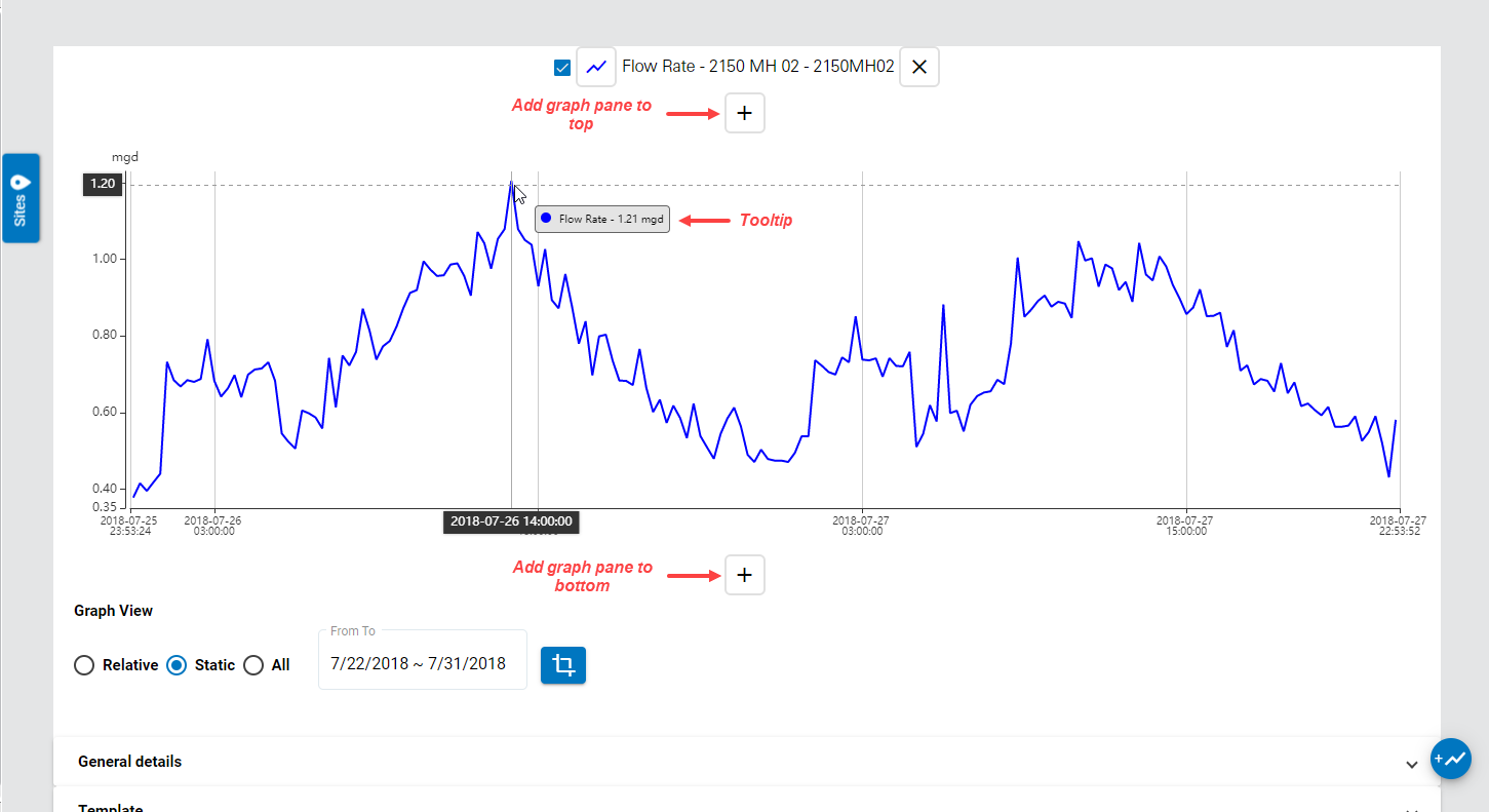
Clicking additional datasets in the dataset list will automatically add new panes to the graph, populated with the selected dataset. To add another dataset to the same pane, click and drag the dataset in the dataset list and drag it into the relevant pane. When a pane contains two datasets, and there is only one pane in the graph, a Graph pane settings button  will be displayed at the left of the graph pane. This button can be used to launch the Panel Properties dialog box and change the panel type from Time Series to Scatter Plot. See Panel Properties for more information on the panel type.
Additional panes can also be added to the graph using the Add graph pane to top and Add graph pane to bottom buttons. If the graph contains empty panes, clicking a dataset will automatically add the dataset to the first empty pane in the graph.
7. To add a dataset to a different pane, click and drag the dataset from the list into the appropriate pane. If all panes contain a dataset, click a dataset in the dataset list to create a new pane with the dataset.
8. Datasets can be removed from the graph by clicking the  button at the end of the dataset name in the legend.
When site selection is complete, the sites list can be collapsed to provide a larger window for working with the graph settings.
9. Click the Sites button to collapse the sites list.
The Graph Range options can be used to define the scope of the graph. The scope of the graph controls the time period for which data is displayed The options include:
• Relative: This option will create a graph where the end of the graph is "now" and the start of the graph is a set number of hours, days, weeks or months previously from "now". A custom option is also available that can be used to specify the number of hours, days, weeks or months to include in the range. Whenever a Relative graph is viewed, the end of the graph will reflect the current date/time and the displayed data range will be updated accordingly.
• Static: This option will create a graph using data from a specific start and end date. When the graph is opened, only data from within the specified range is retrieved from the database, regardless of the current date/time. If the start and end dates are not defined when datasets are added to the graph then all data from the database is retrieved.
10. For a Relative graph:
• Select an option from the Data Date drop-down list.
• If you chose Last (custom), select a value and a time period from the drop-down lists added to the display.
11. For a Static graph:
• Click the From field to display the calendar tool.
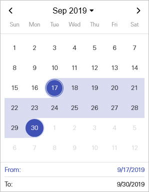
• Click the start date for the date range, which will close the calendar and populate the From field.
• Click the To field to display the calendar tool.
• Click the end date for the date range, which will close the calendar and populate the To field.
The view of the graph can then be zoomed and/or panned as needed and the Set view  button can be used to retain that view when switching between the Configure Graph screen and the main graph display.
Dataset Display Properties
Once datasets have been selected for the graph, the display properties can be defined for each dataset in the graph.
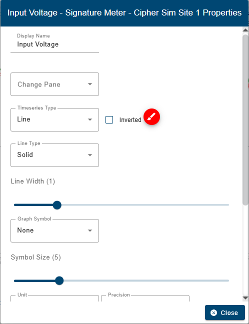
1. Click a dataset name in the graph legend.
The dataset properties dialog box is displayed.
Property | Description |
|---|---|
Display Name | The name that will be displayed for the quantity in the graph. This name will be used in the graph legend, graph tooltip, graph table, and any exported PDF/CSV outputs. This will not change the name of the quantity in the database. |
Change Pane | Change the pane of the graph that the dataset is displayed in. Selecting a different pane from the drop-down list will move the dataset from the original pane to the selected pane. |
Time Series Type | The graph format to be used when configuring a time series graph. The data can be displayed as a single line or as filled bars. This setting is only applicable if creating a time series graph; it has no affect on scatter plot graphs. |
Inverted | Invert the Y-axis of the dataset. Data values will increase from top to bottom in the graph instead of the default bottom to top. |
Line Color
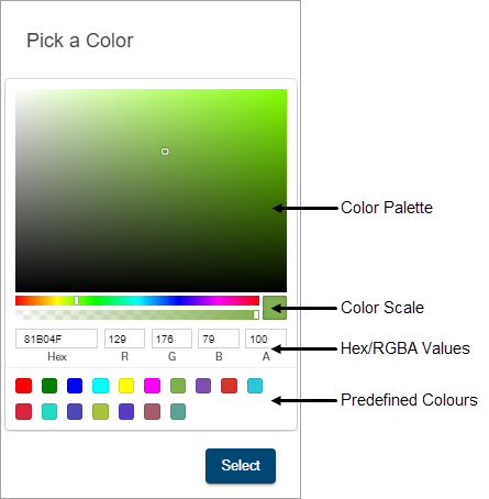
| The color used to display the dataset in the graph. This is defined by the Data Types settings in the Preferences tab of the user’s profile page, but can be changed if the default color is not appropriate. 1. Click the color selector button to launch the color picker tool.
Several methods are available for selecting a color: • Color palette: Move the color slider up/down the color scale bar to select a general color family and then click in the color palette to select a specific color. • Hexidecimal values: Enter the hexidecimal number of the desired color in the Hex field. • RGB values: Enter the RGB (red, green, blue) values of the desired color in the appropriate fields. • Predefined colors: Click one of the predefined color blocks to select that color. 2. Select a color using the various tools available in the color picker. 3. Click Save. |
Line Type | The display format of the line in the dataset, either a solid line, a line of dashes or a line of dots. |
Line Width | The width of the line representing data in a time series graph, measured in pixels. 1. Click and drag the control to the desired width. |
Graph Symbol | The shape to use to display points in a dataset in a graph. 1. Select a shape from the drop-down list. |
Symbol Size | The size of the data points in a graph, measured in pixels. This setting is only applicable if the Points Shape property is set to something other than None. 1. Click and drag the control to the desired size. |
Units | The unit of measure to use for the data in a graph. 1. Select an option from the Unit drop-down list. |
Precision | The number of decimal places to use for the data in a graph. 1. Select the number of decimal places from the Precision drop-down list. |
Data Handling | This option is used to control how points in the dataset are handled in the graph if the points have error codes. This setting overrides the Data Handling option in the Preferences tab of the User Profile screen that is applied to all datasets by default. See Preferences for more information on this option. There are four possible settings: • Use existing value (default): The point retains its current value. • Use zero reading: A zero reading will replace the value of the point value. • Repeat last reading: The point value is updated to use the value of the previous point in the dataset. • Interpolate: A value is interpolated for the point using the last non-zero, non-error values, before and after the error point(s). When a dataset is loaded in a graph, if any of the data points have error codes, this setting will be applied to the point values. |
Reduced Legend | Enable this option to reduce the amount of information included in the graph legend. When enabled, each quantity in the legend contains only the name of the quantity; the site and device names are removed. |
Display Total | Display the total value of data displayed for each dataset in the graph. This value will be displayed beside the dataset name in the graph legend. This value is computed dynamically for the points in view as the view is zoomed and panned. This option is enabled by default for some data types. |
Display Average | Display the average value of data displayed for each dataset in the graph. This value will be displayed beside the dataset name in the graph legend. This value is computed dynamically for the points in view as the view is zoomed and panned. This option is enabled by default for all data types. |
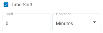
Time Shift | Shift a dataset in the graph forward or backward in time to preview the changes without changing the original data or creating a new graph. A positive value will shift the data forward by the specified number of minutes and a negative value will shift it backwards. The shift value can be specified as Seconds, Minutes, Hours, Days, Weeks, Months or Years. Once a shift is applied, the name of the dataset in the graph legend will be appended with the label "Time Shift". A second instance of the dataset can be added to the same graph pane for comparison purposes, if desired. Because this is a property of the graph and not an edit to the data, the time shift is always present when the graph is opened but the dataset is not available as a computed dataset. The Time Shift function in the Compute Dataset page can be used if the time shift is to be applied to a dataset and not the specific graph. See Compute Datasets for more information.
Note: Datasets with the Time Shift property applied cannot be edited. 1. Enter a value for the Shift. 2. Select the shift value Operation. |
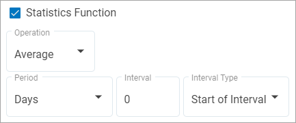
Statistics Function | Apply a statistics function to a dataset in a time series graph and have the statistics reported in the graph at user-specified intervals. The possible statistics functions include: • Average • Minimum • Maximum • Sum The interval is defined by a number of Minutes, Hours, Days, Weeks or Months. The calculated value for each interval can be displayed at either the beginning of the interval or the end of the interval. Note: For Flow Rate datasets, the Volume function is available instead of Sum.
1. Select the type of Operation to apply to the data. 2. Select the Period length for each interval. 3. Enter the Interval value. 4. Select the Interval Type to determine where the statistical values will be displayed. 5. Select the time of day that will be used as the starting time for collecting data for each day. |
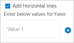
Add Horizontal Lines | Display one or more horizontal dashed lines in the graph as visual aids. The lines are added at user-specified points based on Y-axis values. These lines will have the same color as the time series data for the dataset. 1. Click the check box to enable the option. A new field is added below the check box.
2. Enter the value at which you want a line to be displayed. 3. Click the plus button to add additional lines, if needed. The value is saved and another field is added to define additional lines as needed. Also, the plus button changes to a minus button allowing a value to be removed. |
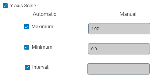
Y-axis Scale | Define the Y-axis scale to be displayed for a dataset while scrolling through a graph. The default settings for the Y-axis is to automatically display the minimum and maximum values of the data currently visible in the graph. As the values of the data in the graph change, the axis values may also change to reflect the current minimum and maximum values displayed. This set of properties can be used to manually specify the minimum and/or maximum values to display in the axis at all times regardless of the values of the data currently displayed in the graph. In the case where more than one dataset is sharing the same Y-axis, defining this property for one dataset will apply the settings to each dataset using the same Y-axis. If there are multiple datasets in the pane, but they each have a separate Y-axis, this property only applies to the single dataset. The Interval property can also be used to specify the interval that values are displayed in the Y-axis. Because this is a property of the graph, the Y-axis will always display according to this property when the graph is opened.
1. To specify the Maximum Y-axis value, click the check box to turn of the Automatic option and enter a value in the corresponding Manual field. 2. To specify the Minimum Y-axis value, click the check box to turn of the Automatic option and enter a value in the corresponding Manual field. 3. To specify the Y-axis interval, click the check box to turn of the Automatic option and enter an Interval value in the corresponding Manual field. Note: When specifying the Y-axis values manually, the input numbers must correspond to the Precision property for the graph pane. |
2. Change the property settings as needed.
3. Click Close.
4. Repeat for other datasets in the graph as needed.
The graph display will be updated to reflect the selected property settings.
Panel Properties
Two panel types are available for displaying data:
• Time Series: data is presented along an X-axis that represents time. A separate data line is displayed for each dataset represented in the graph.
• Scatter Plot: the two datasets are plotted in one pane using their values as cartesian coordinates where the first dataset assigned to the pane will be plotted on the X-axis and the second dataset assigned to the pane will be plotted on the Y-axis.
The panel type is controlled by the Panel Properties, which is accessible from the Graph pane settings button at the left of the graph pane. This button is only available if the graph contains a single pane populated with two datasets. If additional panes or datasets are added, or if the pane only contains one dataset, the button automatically changes to the Delete graph pane button and the Panel Properties dialog box is no longer accessible.
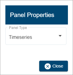
To select the panel type:
1. Click the Graph pane settings button.
2. Select a type from the Panel Type drop-down list.
3. Click Close.
If Scatter Plot was selected, additional fields will be displayed to select the size and color to use to display the points in the graph.
4. Select a Point Size and Points Color as needed.
The graph preview will be updated with the selection and is now ready to be created using the Create button. This will launch the Save Graph dialog box, which is used to specify an identifier for the graph. This is explained in the Graph Creation Details section.
Graph Creation Details
When all settings for the graph have been defined, the Create button can be used to create the graph. Clicking this button will launch the Save Graph dialog box, which is used to specify an identifier for the graph.
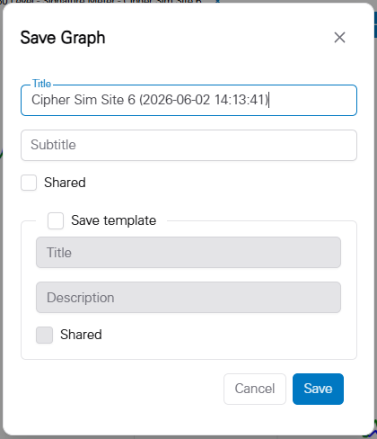
The Title of the graph must be unique within the Flowlink Cipher database. By default, the Title will be the name of the first site selected for the graph. To reduce the number of steps a user must make to quickly create a new graph, and to ensure the Title of the graph will be unique, if the default Title already exists in the database, then an extension will be automatically added with a timestamp pattern YYYYMMDDhhmmss.
The Subtitle field is optional and is blank by default, but it is recommended that it be populated with something that indicates the purpose of the graph and the data it reports.
1. Type a name for the graph in the Title field.
2. Type an informative label in the Subtitle field.
The Shared option can be enabled to allow other users to view the graph when Show Public Graphs is enabled on the Analysis page. Users will be able to view the graph, but will not be able to edit it.
3. Enable Shared if the graph should be visible to other users.
The Save template option can be enabled to save the graph settings as a template for future graph creation. This will add an entry to the Templates view of the Analysis page.
4. Enable Save template.
The template fields will be enabled to specify a Title and Description for the template. The template can also be made available for other users by enabling the Shared option.
5. Type a Title and Description in the appropriate fields.
6. Click Save to complete the creation of the graph.
Note: If the graph settings are edited after it has been created, the Create button changes to an Update button.