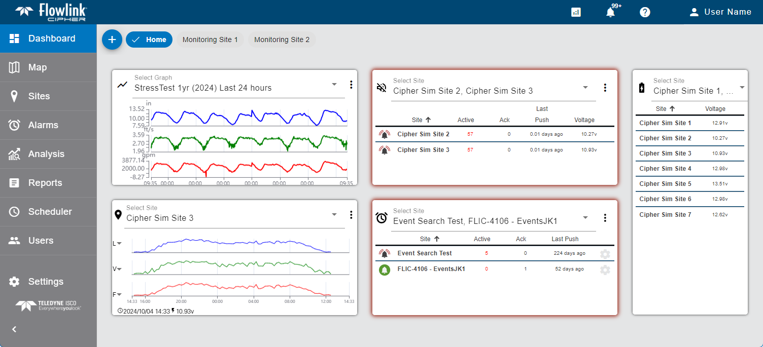
The Dashboard is the first page displayed when Flowlink Cipher is launched. This page displays a collection of gadgets that provide a quick overview of incoming data and site statuses. Information about dashboards and their gadgets is provided below. Click the headings to expand each section.
Dashboards
Users can create multiple dashboards to help organize gadgets. This allows all related gadgets to be kept in a single dashboard separated from unrelated gadgets, keeping the dashboard uncluttered and allowing larger real estate for each gadget. This also provides users with a one-step option of viewing all information pertaining to a specific area or subject.
Dashboards can be created as shared or private. A private dashboard is available only to the user that created the dashboard. A shared dashboard is accessible to other users for the purpose of copying the dashboard to their user accounts. This allows a user, such as an administrator, to create dashboards and populate them with gadgets relevant to a specific task or user. The dashboards can then be copied by other users, eliminating the need for those users to setup gadgets. Once copied, the new dashboard can be modified by the user if needed. New dashboards are created as Private by default, but can be set to Shared using the Manage Dashboards tool.
Copies of shared dashboards do not receive updates if changes are made to the original dashboard after it has been copied. Once a user copies a dashboard, the copied version is equivalent to a new dashboard created by that user and has no connection to the original dashboard, similar to copying a file from one location to another. |
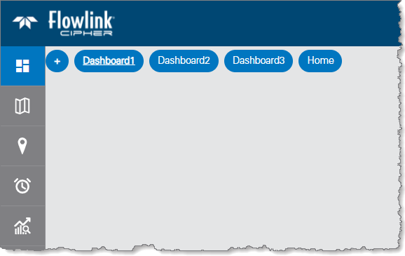
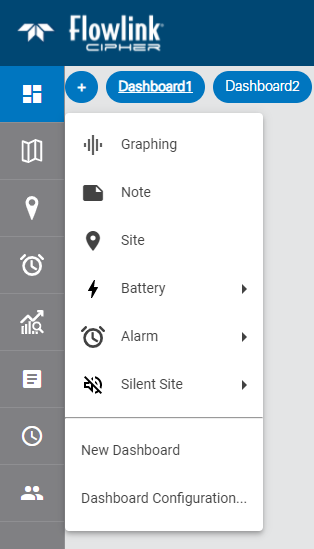
The default dashboard is named Home and is displayed as a button in the top-left corner of the Dashboard screen. Each time a dashboard is created or copied by a user, it is added as another button at the top of the screen in alphabetical order. These buttons are used to select the dashboard to display. The button of the active dashboard will be displayed in blue text and underlined, indicating which dashboard is in use. The order of the buttons can be changed by clicking and dragging each button to the desired position. If there are numerous dashboard buttons present and they cannot all be displayed on the screen, a horizontal scroll bar will automatically be added to scroll to the available buttons.
In the top-right corner of the screen is the Dashboard toolbar, which provides the following functions:
Tool | Description |
|---|---|
| Create New Dashboard: This tool launches the Create New Dashboard dialog box, which is used to create new dashboards or copy shared dashboards. See below for information on this tool. |
| Manage Dashboards: This tool launches the Manage Dashboards dialog box, which is used to edit and/or delete dashboards for the current user. See below for more information on this tools. |
| Lock/Unlock Dashboard: This tool is used to lock and unlock the dashboard. When locked, gadgets cannot be added, removed or moved in the dashboard. |
| Save: This tool is used to save changes to the current dashboard. The tool button is only displayed when a gadget has been added, removed or moved in the dashboard. |
| Cancel: This tool is used to undo changes made to the dashboard that have not been saved. The tool button is only displayed when a gadget has been added, removed or moved in the dashboard. Once a change has been saved, this function is no longer available. |
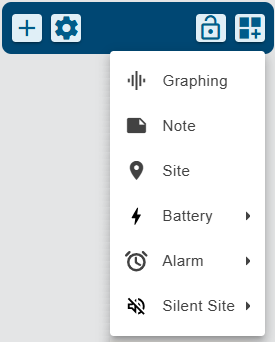
| Add Gadget: This tool provides a drop-down list of available gadgets that can be added to the dashboard. See Gadgets for information on gadgets. This function is disabled if the dashboard has been locked. |
Create New Dashboard
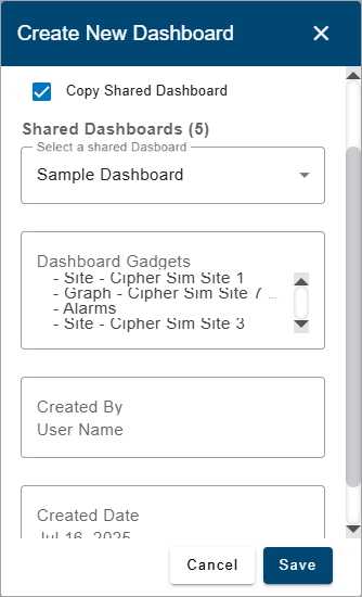
The Create New Dashboard tool is used to create a new dashboard or copy a shared dashboard. When selected, it launches the Create New Dashboard dialog box.
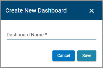
1. Enter a name for the new dashboard.
2. If copying a shared dashboard, click the Copy Dashboard check box to display a drop-down list of available dashboards.
3. Select a dashboard from the Shared Dashboards drop-down list.
Additional fields will be displayed with information about the selected dashboard, including the gadgets that present in the dashboard.
4. Click Save.
A new button is added at the top of the Dashboard page with the dashboard name specified.
5. Click the newly added button to display and work with the new dashboard.
If a shared dashboard was copied, the dashboard will already be populated with the gadgets that were present in the original dashboard as long as those gadgets contained shared data (public graphs, etc). If the gadgets contained only private data, the gadgets will not be displayed.
Manage Dashboards
The Manage Dashboards tool launches the Manage Dashboards dialog box.
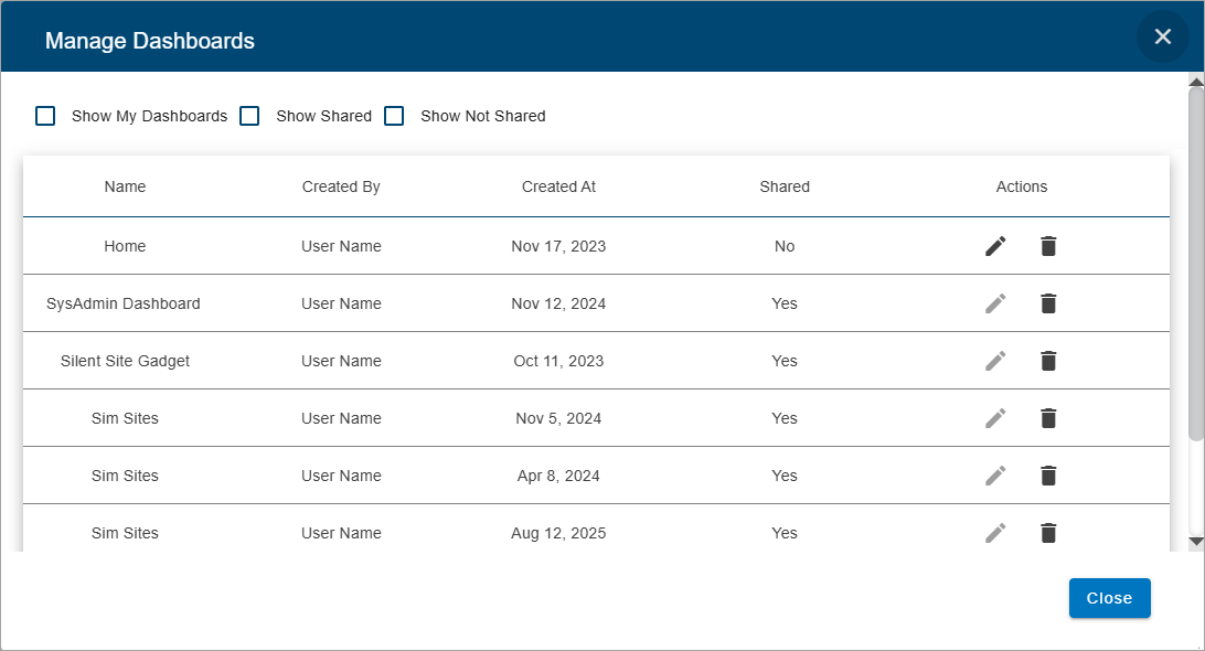
This dialog box is used to rename, share or delete existing dashboards. A dashboard can only be renamed or shared by the user that created the dashboard. A dashboard can be deleted by either the user that created it, or a user with the Administrator role. Check boxes above the table can be used to filter the dashboards listed.:
• Show My Dashboard: This option will display only the dashboards available in the Dashboard tab for the current user.
• Show Shared: This option will display only shared dashboards available from other users.
• Show Not Shared: This option will display only the dashboards of the current user that are not marked as shared.
The table below describes the various functions available in the Manage Dashboards dialog box. Expand each section by clicking each task in the table.
I want to... |
Rename a Dashboard The name of a dashboard should be related to the content in the dashboard to easily identify its purpose and the information it provides. If the purpose or content of a dashboard changes, or is unknown at the time of creation, it may be necessary to rename the dashboard. To rename a dashboard: 1. Click the Manage Dashboards button 2. Click the Edit button The Name field for the dashboard will be put into edit mode and additional tools are added in the Actions column.
3. Type a new name in the field. 4. Click the Save button 5. Click Close to close the dialog box. |
Share a Dashboard The state of a dashboard determines whether it is shared or private. • A shared dashboard can be copied by other users. • A private dashboard is accessible only to the user that created it. New dashboards are created as Private by default. The current state is displayed beside the check box in the Dashboard Configuration dialog box. 1. Click the Manage Dashboards button 2. Click the Edit button The Shared field for the relevant dashboard changes to a check box and additional tools are added in the Actions column. If the dashboard was already shared, the check box will be enabled, if not, it will be empty.
3. Click the Shared check box to enable the option. 4. Click the Save button 5. Click Close to close the dialog box. |
Delete a Dashboard A dashboard that is no longer needed can be deleted from Cipher. Once deleted, it cannot be retrieved. 1. Click the Manage Dashboards button 2. Click the Delete button A message is displayed confirming the deletion of the dashboard.
3. Click Yes to perform the deletion. The dashboard button is removed from the dialog box and the Dashboard screen. 4. Click Close to close the dialog box. |
Gadgets
A Note type gadget is added to the dashboard the first time that a user connects to Flowlink Cipher. This gadget is populated with a welcome message containing information to help a new user get started. All other gadgets are manually added to the dashboard by the user.
The types of gadgets available include:
Gadget Type | Icon | Description |
|---|---|---|
Graphing |
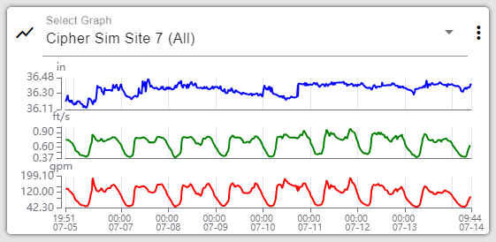
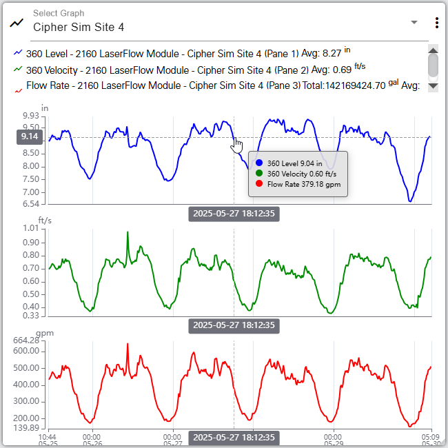
| This gadget is used to show a live preview of an existing graph. Each time new data is available for the graph, the gadget will automatically be updated with the latest data.
A legend is provided at the top of the graph. The legend identifies the dataset represented by each line. When the gadget is too small to display the legend, left and right arrow buttons in the top-right corner of the gadget can be used to scroll through the names of the datasets in the legend. Hovering the mouse cursor over the graph will cause tooltips to be displayed for the data in the graph. The tooltip contains the name of each dataset in the graph, the color associated with each dataset and the value with units at the location of the cursor. If a data point in the graph was ingested with an error code assigned to it from the device, the code will also be included in the tooltip. See Error Codes for Data Points for a table of possible error codes. This tooltip will update as the cursor moves from one dataset to the next in the graph.
The wheel button on the mouse can be used to zoom in and out of the graph and the left mouse button can be used to drag the graph to the left and right to pan the visible data range. Note: Panning and zooming the data in the display is temporary, if a different page in the system is viewed, the display in the graph gadget will reset to the time range defined in the graph configuration when the user returns to the Dashboard page. The Options button • Settings: Return the gadget to the Settings state to change the settings used to define the display of data in the gadget. • Go to Graph: Go to the details page of the graph being displayed in the gadget. • Delete: Delete the gadget from the dashboard. This does not affect the data source associated with the gadget, it only removes the gadget. |
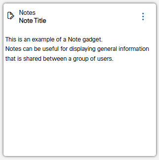
Note |
| This gadget is used to display textual notes that have been manually entered by the user.
|
Site |
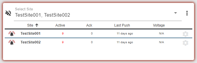
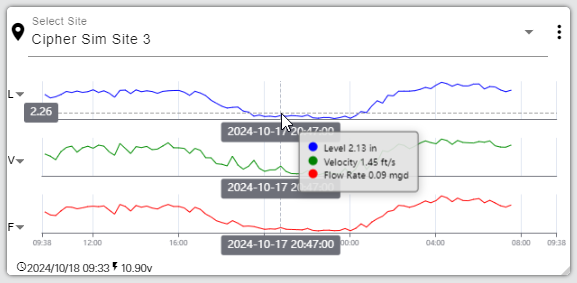
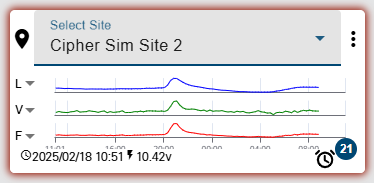
| This gadget is used to display information about a specific site, including a graph of the most recent level, velocity and flow rate data and a timestamp of the last time data was ingested from the site.
The graph data will be displayed according to the settings in the Preferences tab of the user profile page and the gadget Options explained below. If these settings have not been defined, the following colors will be used by default: • Level - Blue • Velocity - Green • Flow Rate - Red Hovering the cursor over the gadget will cause tooltips to be displayed for the data and the axis values. The data tooltip contains the name of each dataset in the graph, the color associated with each dataset and the value with units at the location of the cursor. If a data point in the graph was ingested with an error code assigned to it from the device, the code will also be included in the tooltip. See Error Codes for Data Points for a table of possible error codes. The X axis tooltips display the timestamp of the cursors current location for each dataset. The Y axis tooltip changes to show the level, velocity or flow rate value at the current location of the cursor. This tooltip will update as the cursor moves from one dataset to the next in the graph. Site gadgets will display with a colored border indicating the status of the site. This allows a quick visual check of the status of each site in the dashboard.
The possible colors include: • Yellow: The Data Last Received option for the site is enabled and the length of time since the site last received data is greater than the threshold, triggering a Silent Site event. The gadget will remain yellow until all Silent Site events triggered for the site have been resolved. • Red: An alarm has been triggered by the site and at least one Data type event has a status of Active or Acknowledged. The color is removed when all Data type events for the site have a status of Resolved. The Options button • Settings: Return the gadget to the Settings state to change the settings used to define the display of data in the gadget. • Go to Site: Go to the details page of the site being displayed in the gadget. • Graph from Site: Go to the Configure Graph page with the site and datasets from the site gadget selected for a new graph. The datasets, and the order in which they are displayed in the site gadget, will be repeated in the new graph. • Delete: Delete the gadget from the dashboard. This does not affect the data source associated with the gadget, it only removes the gadget. At the bottom of the site gadget, the following information and controls are provided: • Elapsed time since last data received. If the site is receiving data, a clock symbol precedes the timestamp. If the site is no longer receiving data, a triangular symbol, with the tooltip Site is not receiving data, precedes the timestamp. • The last received value from voltage type datasets named Input Voltage in the site. • An alarm icon with a count if alarms have been triggered at the site. Clicking this icon displays a menu with the following options: These items will automatically be updated with new values each time new data is available for the site. |
Battery |
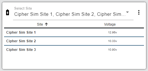
| This gadget is used to view the last received battery voltage at a site(s). This is useful in monitoring for sites with low battery voltage. The gadget can report voltages for a single site, a user-specified selection of sites, all sites in a specific tenant or all sites assigned a specific tag. If a tenant, tag or selection of sites is selected, the gadget is populated with a list of sites in the tenant or selection, or with the specified tag. The list can be sorted by either the site names or the voltage values by clicking on the column headings. An arrow will be displayed beside the column heading indicating which value the list is being sorted by and the direction. The values in the list will be updated automatically each time new data is available for the selected site(s).
If the user is assigned to a tenant, only sites belonging to that tenant will be visible in the gadget. Clicking a site name in the list will go to the site information page for that site. The Options button • Settings: Return the gadget to the Settings state to change the settings used to define the display of data in the gadget. • Delete: Delete the gadget from the dashboard. This does not affect the data source associated with the gadget, it only removes the gadget. |
Alarm |
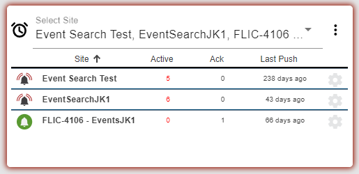
| This gadget is used to display a list of all active alarms for a site(s). Alarms can be reported for a single site, a user-specified selection of sites, all sites in a specific tenant or all sites assigned a specific tag. If a tenant, tag or selection of sites is selected, the gadget is populated with a list of the sites in the tenant or selection, or with the specific tag, that have active or acknowledged alarms. This allows monitoring the health of multiple sites in a single function. Sites included in the search criteria that do not have alarms will not be displayed in the gadget. The list will be updated automatically each time a new alarm is triggered for a selected site or new information is available for an alarm in the list (alarm status, last data push, etc.). Alarm gadgets will display with a red border if the list contains a Data alarm. The red border will remain until all Data events for all sites selected for the gadget are resolved.
The list of alarms includes the following information for each site in the list: • alarm status • site name • number of active alarms • number of acknowledged alarms • date of the last data ingestion The list can be sorted by any of these values by clicking on the column headings. An arrow will be displayed beside the column heading indicating which value the list is being sorted by and the direction. The list also provides a button Clicking a site name in the list will go to the site information page for that site with the Events tab displayed. This tab provides the details of each alarm for the site. Icons beside each site in the list indicate the current status of the alarms for that site, either: • • These icons can be used to change the status of the alarms for a site. Clicking an Active icon will transition all alarms for that site to a status of Acknowledged. Clicking an Acknowledged icon will transition all acknowledged alarms for that site to a status of Resolved and that site will be removed from the list. The Options button • Settings: Return the gadget to the Settings state to change the settings used to define the display of data in the gadget. • Acknowledge All Alarms: Acknowledge all alarms in all sites selected in the gadget. Entries will also be added to the site logs for each site that is updated. • Resolve All Alarms: Resolve all alarms that have a status of Acknowledged for all sites selected in the gadget. Once this has been done, the status of those alarms will be updated to Resolved. Any alarms with a status of Active will remain unchanged; they must have their status updated to Acknowledged before they can be resolved. A message will be displayed confirming the status change when this option is applied. Entries will also be added to the site logs for each site that is updated. • Delete: Delete the gadget from the dashboard. This does not affect the data source associated with the gadget, it only removes the gadget. |
Silent Site |
| This gadget is used to display a list of sites with active alarms for missed data ingestions based on the threshold setting for Data Last Received on each site's information screen. The gadget can report alarms for a single site, a user-specified selection of sites, all sites in a specific tenant or all sites assigned a specific tag. If a tenant, tag or selection of sites is selected, the gadget is populated with a list of the sites in the tenant or selection, or with the specific tag, that have active or acknowledged silent site alarms. This allows monitoring the health of multiple sites in a single function. Sites included in the search criteria that do not have alarms will not be displayed in the gadget. The list will be updated automatically each time a new alarm is triggered for a selected site or new information is available for an alarm in the list (alarm status, last data push, etc.). Silent Site gadgets will display with a colored border when alarms have been triggered for one of the sites selected for the gadget. The possible colors include: • Yellow: The Data Last Received option for the site is enabled and the length of time since the site last received data is greater than the threshold, triggering a Silent Site event. The gadget will remain yellow until all Silent Site events triggered for the selected sites have been resolved. • Red: An alarm has been triggered by the site and at least one Data type event has a status of Active or Acknowledged. The color is removed when all Data type events for the selected sites have a status of Resolved.
The list includes the following information for each site in the list: • alarm status • site name • number of active alarms • number of acknowledged alarms • date of the last data ingestion • battery voltage The list can be sorted by any of these values by clicking on the column headings. An arrow will be displayed beside the column heading indicating which value the list is being sorted by and the direction. The list also provides a button Clicking a site name in the list will go to the site information page for that site. From there, the Events tab can be used to view the details of each alarm for the site. Icons beside each site in the list indicate the current status of the alarms for that site, either: • • These icons can be used to change the status of the alarms for a site. Clicking an Active icon will transition all alarms for that site to acknowledged. Clicking an Acknowledged icon will transition all acknowledged alarms for that site to resolved and that site will be removed from the list. The Options button • Settings: Return the gadget to the Settings state to change the settings used to define the display of data in the gadget. • Acknowledge All Alarms: Acknowledge all alarms in all sites selected in the gadget. Entries will also be added to the site logs for each site that is updated. • Resolve All Alarms: Resolve all alarms that have a status of Acknowledged for all sites selected in the gadget. Once this has been done, the status of those alarms will be updated to Resolved. Any alarms with a status of Active will remain unchanged; they must have their status updated to Acknowledged before they can be resolved. A message will be displayed confirming the status change when this option is applied. • Delete: Delete the gadget from the dashboard. This does not affect the data source associated with the gadget, it only removes the gadget. |
Gadgets are displayed on the dashboard in a grid format, with each gadget occupying one or more cells in the grid. As gadgets are added, they are automatically snapped to the next available cell in the grid, going from left to right, top to bottom. Each gadget can be resized and/or repositioned as needed.
The table below describes the various functions available for gadgets. Expand each section by clicking each task in the table.
I want to... |
|---|
Add a Site Gadget To add a gadget to a dashboard: 1. Click the Add Gadget button A list of available gadget types is displayed.
2. Click the type of gadget you want to add. A new gadget will be added to the dashboard. By default, the gadget will be added as a single cell in the next available grid cell.
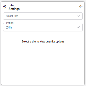
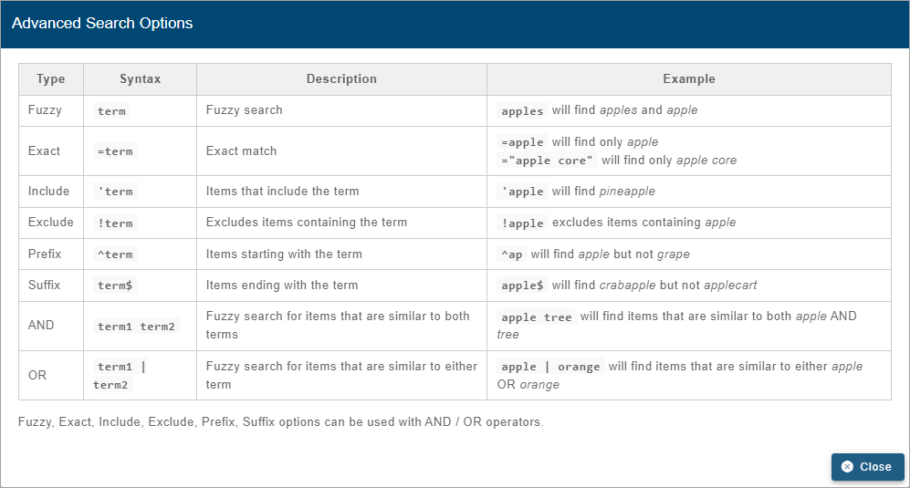
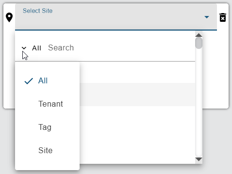
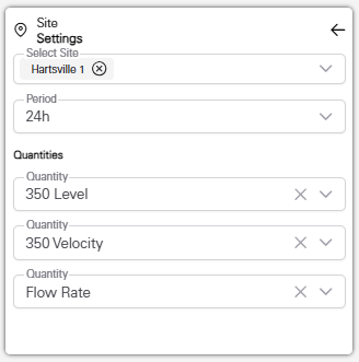
The gadget is populated by selecting a site from the Select Site field. Clicking in this field will display a list of all sites available to the user. If the user has been assigned to a tenant, the list will only contain the sites in that tenant. Similarly, if Preferred Tags have been specified in the Preferences tab of the current user profile, the list will display a "Tags applied" indicator and only sites assigned those tags will be included in the list. If the "Show inactive sites..." option has not been enabled in the Preferences tab, only active sites will be available. See Preferences for more information on these options. The list of sites can be filtered by specifying text in the Search field at the top of the list. Only sites that match the text specified will be included in the list. Advanced Search characters can also be specified with the text to perform different types of searches, some more specific, some more general. Clicking the Advanced Search Options link below the Search field will display a chart of the possible search types and how to use them. The AND/OR operators can also be used in combination with the other Advanced Search options if needed.
A drop-down list beside the Search field can be used to filter the list even further by specifying the property in which to search for the matching text. Also, when a property is selected from the drop-down list, clicking in the Search field will display a drop-down list of possible values based on the selected property, allowing a value to be selected instead of entering it manually. When an option is selected, only sites with text in the selected property (tenant, tag, etc.) will be available.
Once a site is selected, additional fields are added to select the datasets to include in the gadget.
When a site contains multiple datasets for the level, velocity and flow rate data types, the lists will default to the first dataset of each type in the datasets list on the Devices tab of the site information page for the selected site. See Devices Tab for more information on the dataset order for site devices. The drop-down menus can be used to select different datasets as needed. Each time new data is available for the datasets selected, the gadget will automatically be updated with the latest data. A time period must also be selected to control how much data is included in the graph displayed in the gadget. The available times are the last 24 hours, 48 hours, 72 hours or 1 week. The graph will be displayed for the selected period of time, regardless of whether or not there is data available for the entire time period. If the time period extends beyond the data in the dataset, the right side of the graph will be empty. For example, if the Change Period is set to 72 hours, but there is only 60 hours worth of data, the data lines in the graph will stop at 60 hours and the last 12 hours of the graph will be empty. 3. Select a time period for the gadget 4. Select the datasets to include in the gadget. 5. Click the arrow button in the top-right corner of the gadget to save the settings and display the gadget. |
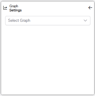
Add a Graph Gadget To add a graph gadget to a dashboard: 1. Click the Add Gadget button A list of available gadget types is displayed.
2. Click the type of gadget you want to add. A new gadget will be added to the dashboard. By default, the gadget will be added as a single cell in the next available grid cell.
The gadget is populated by selecting a graph from the drop-down list. This list contains all graphs that are available to the current user. This includes graphs created by the current user as well as shared graphs created by other users in the same tenant, if the user has been assigned to a tenant. 3. Select the graph to include in the gadget. 4. Click the arrow button in the top-right corner of the gadget to save the settings and display the gadget. |
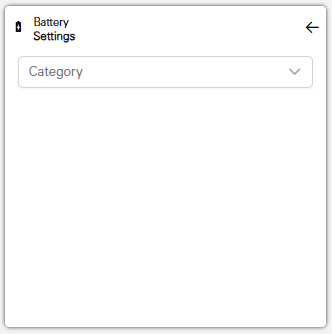
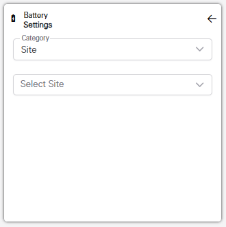
Add a Battery, Alarm or Silent Site Gadget To add a Battery, Alarm or Silent Site gadget to a dashboard: 1. Click the Add Gadget button A list of available gadget types is displayed.
2. Click the type of gadget you want to add. A new gadget will be added to the dashboard. By default, the gadget will be added as a single cell in the next available grid cell.
For these gadget types, it is necessary to select the input source for the data to be reported in the gadget. The selection is first filtered by choosing either Site, Tag or Tenant as the category. An additional drop-down list is then displayed, populated according to the selected category.
From this list, a site, tenant or tag must be selected. Based on that selection, the gadget will then report information for either the selected site, or all sites in the selected tenant, or all sites with the selected tag. 3. Select a Category to filter the options of input sources. 4. Select the desired input source. 5. Click the arrow button in the top-right corner of the gadget to save the settings and display the gadget. |
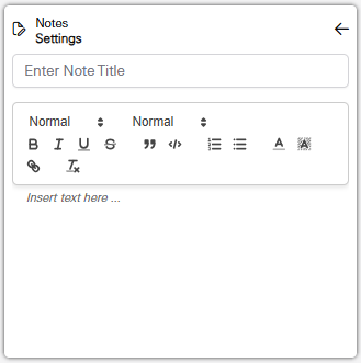
Add a Note Gadget To add a Note gadget to a dashboard: 1. Click the Add Gadget button A list of available gadget types is displayed.
2. Click the type of gadget you want to add. A new gadget will be added to the dashboard. By default, the gadget will be added as a single cell in the next available grid cell.
Various settings are available to include a title in the note and to adjust the font and characters of the text in the note, similar to text editing applications. It a title is specified, it will be displayed in bold at the top of the note, below the gadget type label. 3. Specify a title for the note, if needed. 4. Enter the text for the note, applying any style settings as needed. 5. Click the arrow button in the top-right corner of the gadget to save the settings and display the gadget. |
Edit a Gadget Existing gadgets can be edited if needed. This includes changing the data source for a gadget, or editing the text in a note gadget. To edit a gadget: 1. Click the Options button The settings fields for the gadget are displayed, similar to when the gadget was first added to the dashboard. 2. Change the settings as needed. 3. Click the arrow button in the top-right corner of the gadget to save the new settings and display the gadget. |
Resize/Reposition a Gadget 1. To resize a gadget, click the bottom-right corner of the gadget and drag the border until the gadget reaches the appropriate size then release the mouse button. 2. To reposition a gadget, click the gadget-type icon in the top-left corner of the gadget and drag it to the desired location then release the mouse button. Dragging a gadget to the edge of the page on the right side of the window will automatically expand the dashboard to add more columns to the grid. When the mouse button is released to drop the gadget, all gadgets will automatically be reduced in size to accommodate the additional columns in the dashboard. The layout of the dashboard will be remembered each time a user logs into the system with the same user account. |


 in the
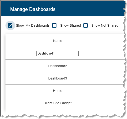
 to save the change to the dashboard.
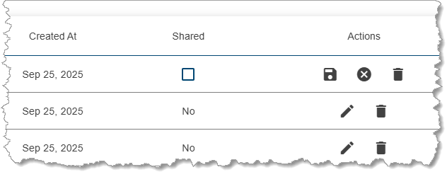
 in the
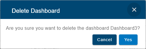
 in the top-right corner of a graph gadget provides the following options:


 to add a new site gadget to the dashboard for the selected site.
  Active: This is displayed if the site has any active alarms.
  Acknowledged: This is displayed if all alarms for the site have been acknowledged.