A graph view screen provides a full detailed view of a graph. This view is used to analyse and edit data in the graph.
When first open, the graph will display data based on the data range settings defined for the graph. For a relative graph, this will be all data within the specified date range. For a static graph, this will be either the data within the specified date range, or a specific view of the data if the Set View function has been applied. Refer to Configure Graph for more information on this option.
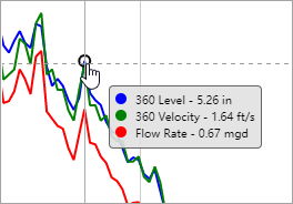
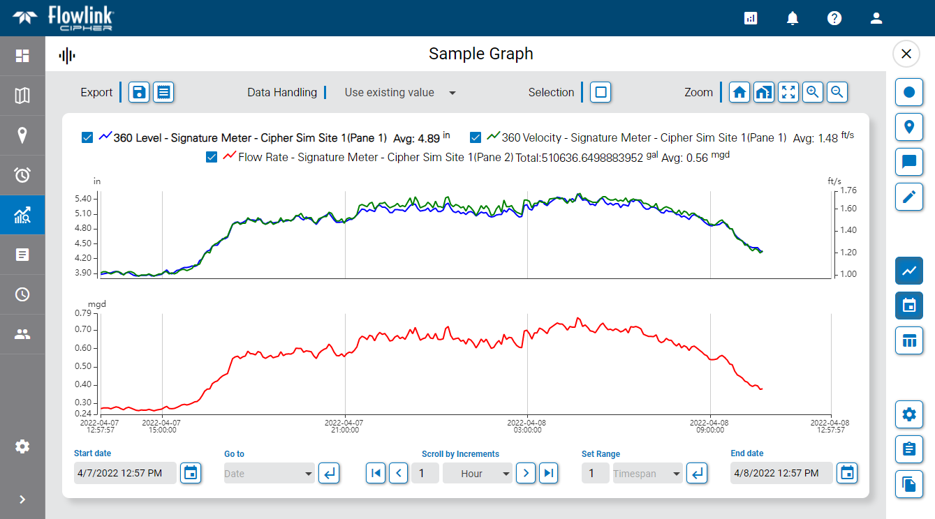
Moving the mouse cursor over the data in the graph will cause tooltips to be displayed for the data and the axis values. The data tooltip contains the name of each dataset in the graph, the color associated with each dataset and the value with units at the location of the cursor. If a data point in the graph was ingested with an error code assigned to it from the device, the code will also be included in the tooltip. See Error Codes for Data Points for a table of possible error codes. The X axis tooltip displays the timestamp of the cursor’s current location for each dataset. The Y axis tooltips change to show the point value of each dataset in the graph pane at the current location of the cursor.
The order of the datasets in the data tooltip reflects the order of the datasets in the legend at the top of the graph, which is based on the order in which the datasets were added to the graph. If the graph contains multiple panes, the first dataset in the tooltip will be the dataset in the pane where the cursor is currently positioned, followed by the remaining datasets according to their order in the legend. This tooltip will update automatically as the cursor moves from one dataset, or pane, to the next in the graph.
The mouse can also be used to zoom and pan the view in the graph.
• To zoom using the mouse, position the mouse cursor in the graph area and scroll the middle mouse wheel forward or backward. The graph display will zoom in or out respectively.
• To pan using the mouse, click and hold the left mouse button anywhere in the graph area. With the button still pressed, drag the cursor to the left or right to pan the graph in that direction.
The axis values and labels for the graph are populated according to the type of graph and the data being displayed.
• For a time series graph, there is an X-axis at the bottom of the graph that is populated with the time period for the data and a Y-axis on the left of the graph containing the data values of the dataset presented in the graph. If the graph contains multiple datasets, additional Y-axis labels will be added on the right of the graph, one for each extra dataset. If the additional datasets use the same unit of measure, they can share a single Y-axis on the right.
• For a scatter plot graph, the points in the graph do not follow a linear time span, so each axis represents one of the datasets in the graph. The X-axis represents the data from the first dataset added to the graph when the graph was created in the Configure Graph page. The Y-axis represents the data from the second dataset added to the graph.
Additional horizontal lines may also be present in the graph in colors matching the data. These lines are added manually in the Dataset Properties for the graph. These lines represent the Y-axis values for the relevant dataset and are meant to act as visual aids when viewing the graph. See Dataset Display Properties for information on adding these lines.
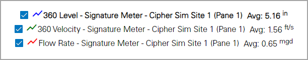
The legend at the top of the graph identifies the datasets in the graph, the color used to display each data and, if enabled, the Total and Average values of the data in each dataset. See Dataset Display Properties for information on enabling these settings. The legend is used to set the active dataset. When selecting and/or editing data, the active dataset is the only dataset that will be affected. To set a dataset as active, click the dataset name in the legend. The name of the active dataset will be displayed in bold text.
Check boxes beside each dataset can be used to temporarily remove a dataset from the graph display without actually removing it from the graph. This will also remove the axis values for the dataset.
The Go to site  button beside each dataset name in the legend can be used to go to the site information page of the site for which the dataset was created.
The legend can also be used to edit the graph settings. Double-clicking an item in the legend will launch the Configure Graph page. On this page, the graph and the display settings for the datasets can be changed. See Configure Graph for more information on this page.
Points in the dataset can be selected by clicking on them in the graph. To select multiple points, press and hold either the Shift key or the Ctrl key while clicking points in the graph. Alternatively, one of the Selection tools can be enabled:
• Select by Rectangle  : When this tool is enabled, click and drag the mouse cursor to draw a rectangle around the relevant area of the graph, selecting all points within the bounds of the area. The Ctrl key can be used to select additional sections of points as needed, similar to selecting additional individual points.
• Select by Range  : When this tool is enabled, click and drag the mouse cursor left or right to select all points within a date range. The Ctrl key can be used to select additional date ranges as needed, similar to selecting additional individual points.
• Clear all selected points  : Select this tool to remove all points from the selection.
If any of the points in the selected datasets have error codes, these points will be displayed with a red highlight and the value reported for those points will be determined by the Data Handling option in Preferences. See User Profile for information on user preferences. If the defined preference is not appropriate for the datasets in the graph, a Data Handling option is available for each dataset in the dataset properties dialog box when editing or creating a graph. This can be used to temporarily apply a different handling method; see Dataset Display Properties for more information. There are four options:
• Use existing value (default): The point remains in the graph with its current value.
• Use zero reading: A zero reading will replace the point value in the graph.
• Repeat last reading: The point value is updated to use the value of the previous point in the dataset.
• Interpolate: A value is interpolated for the point using the last non-zero, non-error values, before and after the error point(s).
The graph view provides several toolbars for adjusting the graph and its data. These tools are explained in the sections below.
Sidebar Tools
The graph view provides a sidebar of tools at the right of the graph. These tools can be used to toggle data on and off on the page or to edit the graph and its data. These tools are explained below.
Button | Description |
|---|---|
| Toggle Original Data Display the original data for any points that have been edited, resulting in both the edited data and the original data being displayed. When enabled, the Y-axis values are updated to reflect the additional data values, if necessary. Original data is only displayed for the currently active dataset. Changing the active dataset while this option is enabled will automatically update the original data in the graph. |
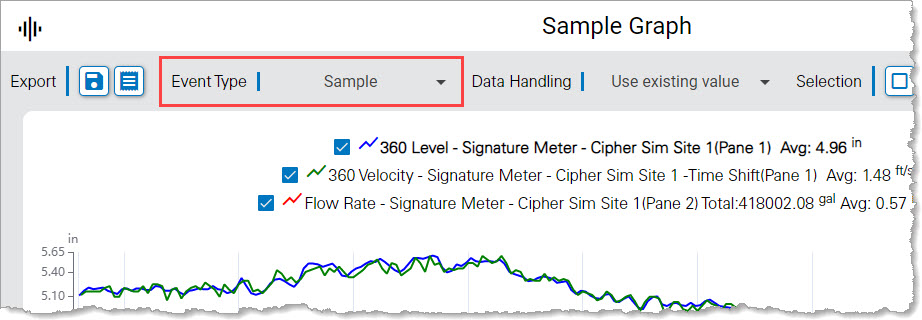
| Display Events Display indicators in the graph for any events that have been created for the data. When enabled, a tool is displayed above the graph that allows selecting the types of events to be displayed.
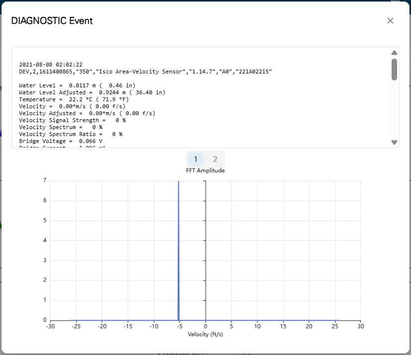
The event types are selected by clicking the check boxes in the drop-down list of the tool. When the list is collapsed, each selected type will be displayed beside the tool name and an events pane will be displayed below the graph, populated with icons for each event found. The shape and color of the icons is controlled by the Events settings in the User Preferences screen, see Preferences for more information. Hovering the mouse cursor over an event indicator will display a tooltip with basic information about the event, including the event type and the start and end times for the event. Clicking the event icon will display an Event pop-up dialog box with detailed information about the event. The information provided will differ for the various event types. For Data type events, a control is provided to set the state of the event to either Active, Acknowledged or Resolved.
|
| Toggle Notes Turn on/off the display of user-added notes in the graph. • When turned on, notes are displayed as colored text boxes, linked to a specific point in the dataset. The notes will display automatically as the data range is changed in the view. • When turned off, all notes are removed from the graph display. Hovering the cursor over a point with a note will display the note as a tooltip. Points with notes are displayed as a diamond symbol. The symbols will be displayed regardless of this tool setting. |
| Edit Data Enable or disable edit mode. When enabled, the data in the graph can be edited. When edit mode is enabled, an Edit toolbar is added to the top of the graph. Only users with the Editor role can enable edit mode. See Editing Graph Data for more information on this functionality. |
| Toggle Graph Turn on/off the graph display. If turned off, the graph is removed from the page completely. Data from the graph can still be viewed in the data table. When the graph display is turned off, the tile for the graph on the Analysis page displays a generic image of a table instead of a preview of the graph; this generic image does not contain any actual data from the graph. This setting is remembered when the graph is reopened in a later session. If both this setting and the Toggle Data Table setting are turned off when the graph is closed, reopening the graph will revert the settings to the default state of displaying the graph and the date toolbar. |
| Toggle Date Toolbar Display the Date toolbar at the bottom of the graph. This toolbar provides controls for adjusting the range of data displayed in the graph according to time and date values. This setting is remembered when the graph is reopened in a later session. |
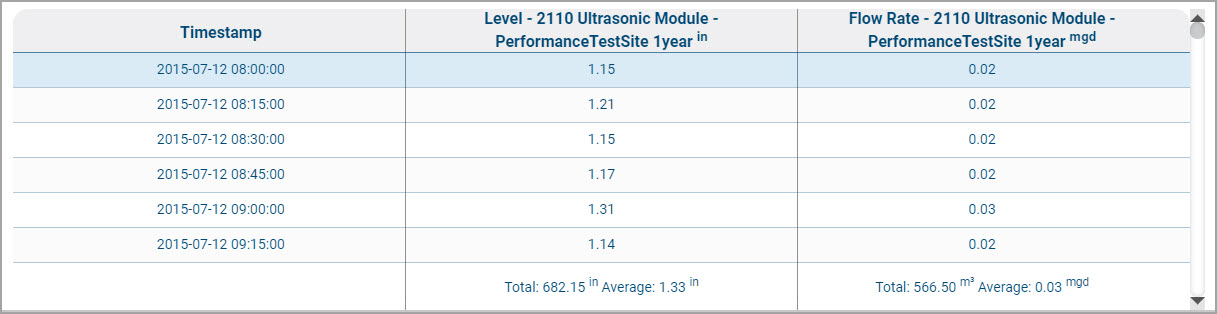
| Toggle Data Table Display the graph data in a table format. If both the graph and the data table are enabled, the table will be displayed below the graph. All data in the graph is included in the table, including the total and average values for each dataset, if those options are enabled for the graph. If a data point in the graph was ingested with an error code assigned to it from the device, the value for that point will be displayed with red text and the error code will be displayed beside the point value in brackets. See Error Codes for Data Points for a table of possible error codes. Each dataset in the graph is represented by a column in the table, with the dataset name used as the column header. The unit of measure for the dataset is also included in the column header.
Clicking a row in the table selects that point. If the graph display is enabled, the point will be selected in the graph as well. Similarly, clicking a point in the graph will select that point in the table, automatically scrolling the table to the location of the point. The Up and Down Arrow keys on the keyboard can be used to change the selection in the table. Holding the Ctrl key while selecting points will select multiple discontinuous points. Holding the Shift key while selecting points will select all points in a continuous range. The Esc key can be used to clear the selection. This setting is remembered when the graph is reopened in a later session. If both this setting and the Toggle Graph setting are turned off when the graph is closed, reopening the graph will revert the settings to the default state of displaying the graph and the date toolbar. |
| Edit Graph Launch the Configure Graph page to edit the settings used to create the graph. Graphs can only be edited by the user that created them; if a public graph is open, this tool cannot be used. |
| Calculate New Dataset Launch the Compute Datasets page and create a new computed dataset to display in the graph. See Compute Datasets for more information on this functionality. |
| Save as Graph Save the existing graph as a new graph with a new name. The new graph will open in edit mode to allow the graph to be modified as needed before completing the creation of the graph. See Configure Graph for information on graph creation. |
Navigation Tools
The controls below the graph can be used to adjust the range of data displayed in the graph based on time and date settings. These controls are explained in the table below.
Button | Description |
|---|---|
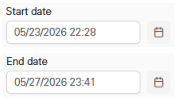
| Start Date/End Date The Start Date and End Date controls are used to define the date range to be displayed in the graph. Complete the following steps for both the Start date and the End date. 1. Click the calendar icon in the control to launch a calendar widget. 2. Click the month or year at the top of the calender, or use the arrows to select the relevant month and year. 3. Click the desired date. 4. Adjust the time settings if needed. 5. Click Set. 6. Repeat to set the End Date. |
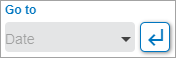
| Go To The Go To control is used to limit the graph to a specific length of time, such as the current day, the previous day, the current week, the current month, etc. When a selection is made, the Start date, End date and Set Range controls are automatically updated to reflect the length of time selected. 1. Click in the field to display a list of available options. 2. Select the desired option. 3. Click the Go To button |
| Scroll by Increments The Scroll by Increments control is used to scroll through the data in the graph, changing the display by a specific time increment with each scroll. Click in the increment units field to display a list of available options. Select an option from the list. Enter the span to be used for the selected unit, such as 2 to scroll by an increment of 2 days. Once an increment has been defined, the Go Back The Go to Start |
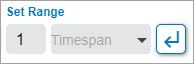
| Set Range The Set Range control is used to define the range of time to be displayed in the graph based on a timespan. When a timespan is selected (Hour, Day, Week, Month, Year), the graph will begin at the current Start date timestamp and will end at the selected range amount. Multiples of the selected range amount are possible by entering a number in the Span field. 1. Select a Timespan from the list. 2. Enter a number in the Span field. 3. Click the Set Range button |
Zoom Tools
The tools in the Zoom toolbar can be used to focus on a particular section of the data. This is helpful when analyzing and editing the data. See Editing Graph Data for information on editing the data. The zoom tools are explained in the table below.
Button | Keyboard Shortcut | Description |
|---|---|---|
| -- | Go Home Zoom and center the graph to the Home extents defined using the Set Home function. If Set Home has not been applied, attempting to use this function will display an error. |
| H | Set Home Save the current view of the graph as the Home view. This saves the current zoom level and date range of the graph display, allowing these settings to be reapplied at anytime to return to this exact view through the Go Home function. 1. Adjust the graph display as needed. 2. Click Set Home or press the H key on the keyboard. |
| A | Full Extent Automatically adjust the graph display to include the full extent of the data available for the current graph. |
| Z | Zoom In Enable or disable the Zoom In tool. When enabled, selecting an area of the graph will zoom to the selected area. 1. Click the Zoom In button to enable the functionality. 2. Click and drag the left mouse button to draw a box over the area to be selected. 3. Release the mouse button when the box covers the desired area. |
| X | Zoom Out Enable or disable the Zoom Out functionality. When enabled, clicking the graph will cause the display to zoom out. |
Export Tools
The Export tools allow the graph and/or data table to be exported as a report in various formats. These tools are explained below.
Button | Description |
|---|---|
| Export Graph to CSV Export the data currently displayed in the graph to a CSV (comma-separated value) file. The resulting file will contain a header with 6 rows followed by a blank row and then, starting on row 8, a data row for each point in the graph. The header rows will be formatted as: • Row 1: Site Name - The name of the site from which each quantity was ingested. • Row 2: ISCO Quantity - The quantity type for each value in the data records. • Row 3: Label - The label that will be displayed for the dataset when viewed in Flowlink Cipher. • Row 4: Units - The units for the values in the data records, which are recorded as abbreviations. • Row 5: Resolution - The number of digits to the right of the decimal point in quantity values. • Row 6: Significant Digits - The number of significant digits to the right and the left of the decimal point in timestamps. See Supported Quantities and Units for a list of the supported quantity types and unit abbreviations. The file will be saved to the Downloads folder of the current Windows user account. The file name will be generated automatically based on the graph title and the timestamp of the export. |
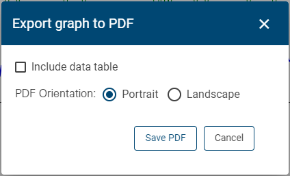
| Export Graph to PDF Generate a PDF report of the data in the current graph. The resulting PDF will contain an image of the graph, along with the title, subtitle and legend for the graph. The data table will also be included if it was selected for inclusion. Clicking the tool button will display a dialog box with options for the export.
• Include data table: Enable this option to include the data table in the report. The table will be exported as two tables of data: one providing all timestamped data values and one providing the highest, lowest, average and total values of the data. The total values are especially important for Total Flow and Rainfall data. • PDF orientation: Select whether the PDF will be created in a portrait or landscape orientation. The PDF will be saved to the Downloads folder of the current Windows user account. The file name of the PDF will be generated automatically based on the graph title and the timestamp of the export. Note: Data is only exported for the date range currently displayed in the graph. Any data outside of that range will not be included in the PDF. |
Editing Graph Data
Users with the Editor role can edit the data in a graph to remove spikes and fill gaps in the data. Editing is done by applying mathematical algorithms to adjust point values or by removing points.
To edit data, edit mode must be enabled.
1. Click the Edit Data button  to enable edit mode.
When edit mode is enabled, an Edit toolbar is added above the graph. These tools are explained below:
Button | Description |
|---|---|
| Manual Edit Manually shift the value of a single selected point in a dataset by dragging the point up or down in the graph to increase or decrease its value respectively. 1. Set the relevant dataset to the active dataset in the legend. 2. Click the Manual Edit button. 3. Select the point to be shifted in the dataset line. 4. Press and hold the mouse cursor and drag the point up or down. As the point moves, a tooltip will be displayed, showing the value of the point at the current location. The dataset line will be adjusted automatically as the point moves.
5. Release the mouse cursor when the point is at the desired value. 6. Repeat steps 3 to 5 to manually adjust additional points. 7. Click the Manual Edit button again to turn it off when finished editing points. |
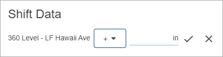
| Shift Data This tool is used to adjust the values of all selected points using one of three possible methods. The method used is determined by the mathematical operator selected in the Shift Data drop-down list: • Constant value (=): Change all selected data points to a single value • Fixed offset (+/-): Increase or decrease the selected points by a fixed amount • Multiply by constant value (x/÷): Multiply or divide the selected points by a specified constant value 1. Set the relevant dataset to the active dataset in the legend. 2. Select the points to be shifted. 3. Click the Shift Data button. The Shift Data dialog box is displayed.
4. Select an operator from the drop-down list. 5. Enter a value in the field or use the up and down arrow buttons to select a value. 6. Click the check mark button to apply the shift. |
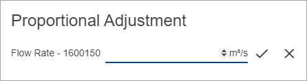
| Proportional Adjustment This tool is used to distribute a value adjustment proportionately over selected points. The proportion of the adjustment applied to each point is determined by dividing the adjustment by the number of selected points. Proportional adjustments can be positive or negative to increase or decrease point values. As adjustments are applied across the selection, the proportion allotted will increase with each point. For example, a proportional level adjustment of 1ft over three points would adjust the first point by 0.33ft, the second by 0.67ft, and the third by 1.0ft. An adjustment of 1ft distributed over five points would adjust the first point by 0.2ft, the second by 0.4ft, the third by 0.6ft, etc. Proportional adjustments can also be used to edit readings generated by a constant adjustment. For example, if points with no value have been adjusted to constant values using a constant adjustment, a proportional adjustment can then be applied to smooth the transition between the readings that preceded and followed those adjusted points. 1. Set the relevant dataset to the active dataset in the legend. 2. Select the points to be shifted. 3. Click the Proportional Adjustment button. The Proportional Adjustment dialog box is displayed.
4. Enter a value in the field or use the up and down arrow buttons to select a value. 5. Click the check mark button to apply the adjustment. |
| Linear Correct This tool is used to interpolate data values to replace incorrect values at timestamps in the data stream. Incorrect values can occur if the monitoring device recorded a spike as real data, or if data was not collected for a timestamp but the device automatically attempted to interpolate the missing data. This process will use linear interpolation to calculate an accurate value for a selected point using the values of neighboring points. 1. Set the relevant dataset to the active dataset in the legend. 2. Select the points to be corrected. 3. Click the Linear Correct button. |
| Smooth Correct This tool is used to interpolate data values to replace incorrect values in the data stream. Incorrect values can occur if the monitoring device recorded a spike as real data, or if data was not collected for a range of time but the device automatically attempted to interpolate the missing data. This process will interpolate new values for the selected points using the value of the point that is previous to the first point in the selection and the value of the point that is after the last point in the selection. 1. Set the relevant dataset to the active dataset in the legend. 2. Select the points to be corrected. 3. Click the Smooth Correct button. |
| Restore to Original Value Restore an edited point to its original value. This can be used to restore a point if it was edited in error or if the edit did not have the desired result. 1. Click the Toggle Original Data button 2. Select the original point in the graph. 3. Click the Restore to Original Value button. The original point value is restored to the point. Note: If restoring a point in a scatterplot graph, point values will be restored in both datasets in the graph. |
| Reject Points Flag points as rejected. Rejected points will be displayed in the graph according to the Data Handling setting in the User Preferences tab and with a red highlight. If the Data Table is displayed below the graph, the values for rejected points will be displayed with red text. 1. Set the relevant dataset to the active dataset in the legend. 2. Select the points to be shifted. 3. Click the Reject Points button. |
| Undo Edits Undo the last edit applied to the dataset. 1. Click the Undo Edits button. |
| Save Edits Save all edits made to the graph. Once edits have been saved, they cannot be undone. 1. Click the Save Edits button. |
| Cancel Edits Undo all edits that have been applied to the dataset. If edits have been saved, this will only undo edits made since the data was saved. 1. Click the Cancel Edits button. |
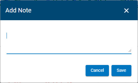
| Add Note / Edit Note The Add Note / Edit Note tool is used to either add a textual note to a point in a graph or edit an existing note. The default state of the button is Add Note, but it changes to Edit Note when a point is selected that already has a note added to it. Notes can contain up to 280 characters. Points with a note added to them will be displayed with a diamond shape. Because the note is linked to a specific point in the dataset, it will be present in all graphs that contain the dataset. Notes are displayed in the graph using the Toggle Notes tool. • When turned on, notes are displayed as a text box in the graph pane with a border color that matches the color of the dataset line. • When turned off, notes are hidden from the display. Hovering the mouse cursor over a diamond point in the dataset will display the single note associated with that point as a tooltip, also with a border color matching the dataset line. If a graph pane is cluttered with multiple notes for multiple datasets, the Legend can be used to turn off the display of a dataset and all notes for that dataset will be hidden. Hovering the mouse cursor over a note symbol will display the note as a tooltip even if the Toggle Notes tool is turned off. The Editor role is required to add or edit notes in a graph. To add a note: 1. Click the Edit data button 2. Select a point in the relevant dataset. 3. Click the Add Note button. The Add Note dialog box is displayed.
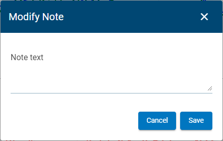
4. Type the note text into the dialog box and click Save. The note is added to the graph pane. To edit a note: 1. Select the point with the note in the dataset. 2. Click the Edit Note button. The Modify Note dialog box is displayed.
3. Enter new text for the note and click Save. |
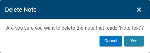
| Delete Note Delete a note from a graph. This is a permanent deletion and cannot be undone. 1. Click the Edit data button 2. Select the point in the dataset with the note to be deleted. 3. Click the Delete Note button. The Delete Note confirmation message is displayed.
4. Click Yes to delete the note. The note is removed from the graph pane. |
2. Apply the necessary edits.
3. Click the Save Edits button to save the changes.
4. Click the Edit Data button to turn off edit mode.
Keyboard Shortcuts
A number of keyboard shortcuts are available when working in a graph view page. Different shortcuts are available for the main graph view and the table view.
Graph View Shortcuts:
Keyboard | Action |
|---|---|
z | Enable/Disable Zoom In |
x | Enable//Disable Zoom Out |
Esc | Disable Zoom In / Zoom Out |
a | Zoom to full extent |
h | Set Home |
s | Enable/Disable Select points by rectangle |
↓ | Move point selection forward in time |
↑ | Move point selection backwards in time |
Esc | Discard selection |
Shift+click | Select more points - continuous |
Ctrl+click | Select more points - discontinuous |
Table View Shortcuts
Keyboard | Action |
|---|---|
↓ | Move table selection forward in time |
↑ | Move table selection backwards in time |
Esc | Discard selection |
Shift+click | Select more rows in table - continuous |
Ctrl+click | Select more rows in table - discontinuous |


 in the control.
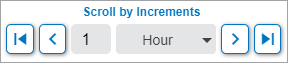
 and
and  can be used to scroll backward and forward according to that increment.
  and
and  buttons can be used to jump to the beginning or end of the data available in the dataset currently selected in the legend.